
Even though they all fall under the umbrella of "minimalism," cabinets designed in Creamy Style, Wabi-Sabi, and Italian Minimalism look like three entirely different species: one is soft and rounded, another is plain and rustic, and the third is calm and sharp. Many project failures do not stem from insufficient budgets, but from a misstep at the very first step—treating style as a color issue rather than a systematic challenge.
The true differences across styles boil down to five customizable dimensions: color systems, surface materials, form language (straight or curved), hardware and details, and lighting ambience. From the perspective of custom furniture execution, this article breaks down the respective approaches and pitfalls of these three styles, helping you lock in the right direction right at the design stage.
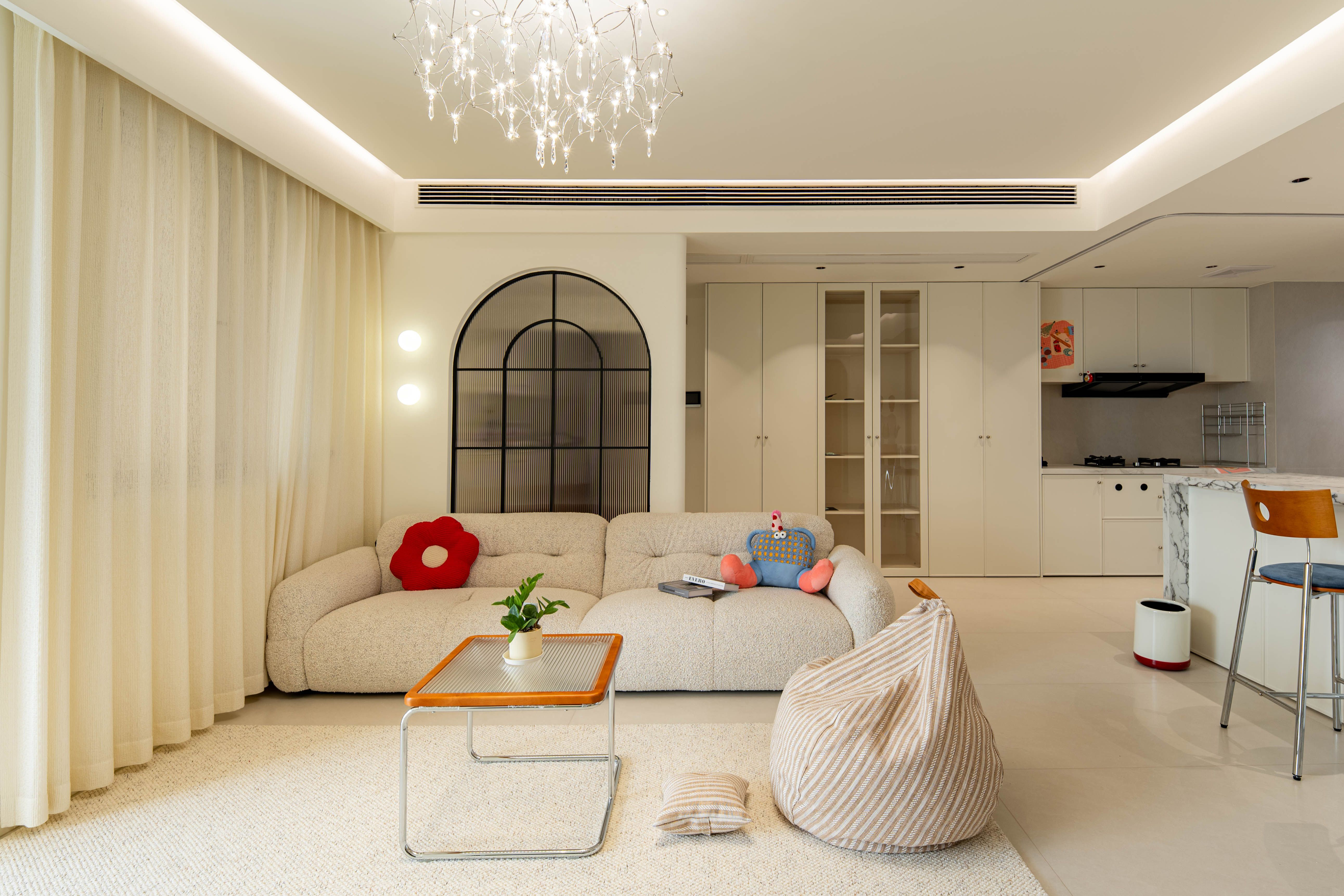
The core of Creamy Style is not "white," but a low-saturation, high-brightness, warm creamy filter—milky white, creamy coffee, oatmeal, and light camel, overall looking as though bathed in soft light.
• Color: Keep the main cabinet colors within the milky-white to creamy-coffee range, with shade variations limited to just one or two degrees. Strictly avoid jarring combinations where pure white and yellowish ivory appear side by side. Kick plates, finishing pieces, and edge banding must match the color precisely; this is the prerequisite for a clean Creamy Style look.
• Materials: Matte or skin-touch surfaces are the primary choice (PET, matte lacquer, delicate wood grain), while high glosses must be firmly avoided—once high gloss enters, the creamy feel instantly transforms into a rental-apartment vibe.
• Form: Creamy Style benefits greatly from "curves." Curved corners, curved kitchen islands, arched elements, and creamy tones are natural partners, yet they test factory craftsmanship the most: the joinery between curves and flat surfaces, and batch-to-batch color consistency, are easily magnified in this soft style.
• Hardware & Details: Handleless designs or color-matched milled profile handles work best; choose push-to-open mechanisms with good damping. For metal accessories, use matte white, champagne gold, or matte light gold, avoiding bright chrome.
• Lighting: Warm lighting around 3000K is the soul of Creamy Style. Cabinet interior LED strips should be soft and diffuse, avoiding direct light spots.
One-Sentence Pitfall Warning: The issue with Creamy Style is never being "not white enough," but rather that mixed materials, messy sheens, and rough joinery will slide it from "gentle" straight down to "cheap."
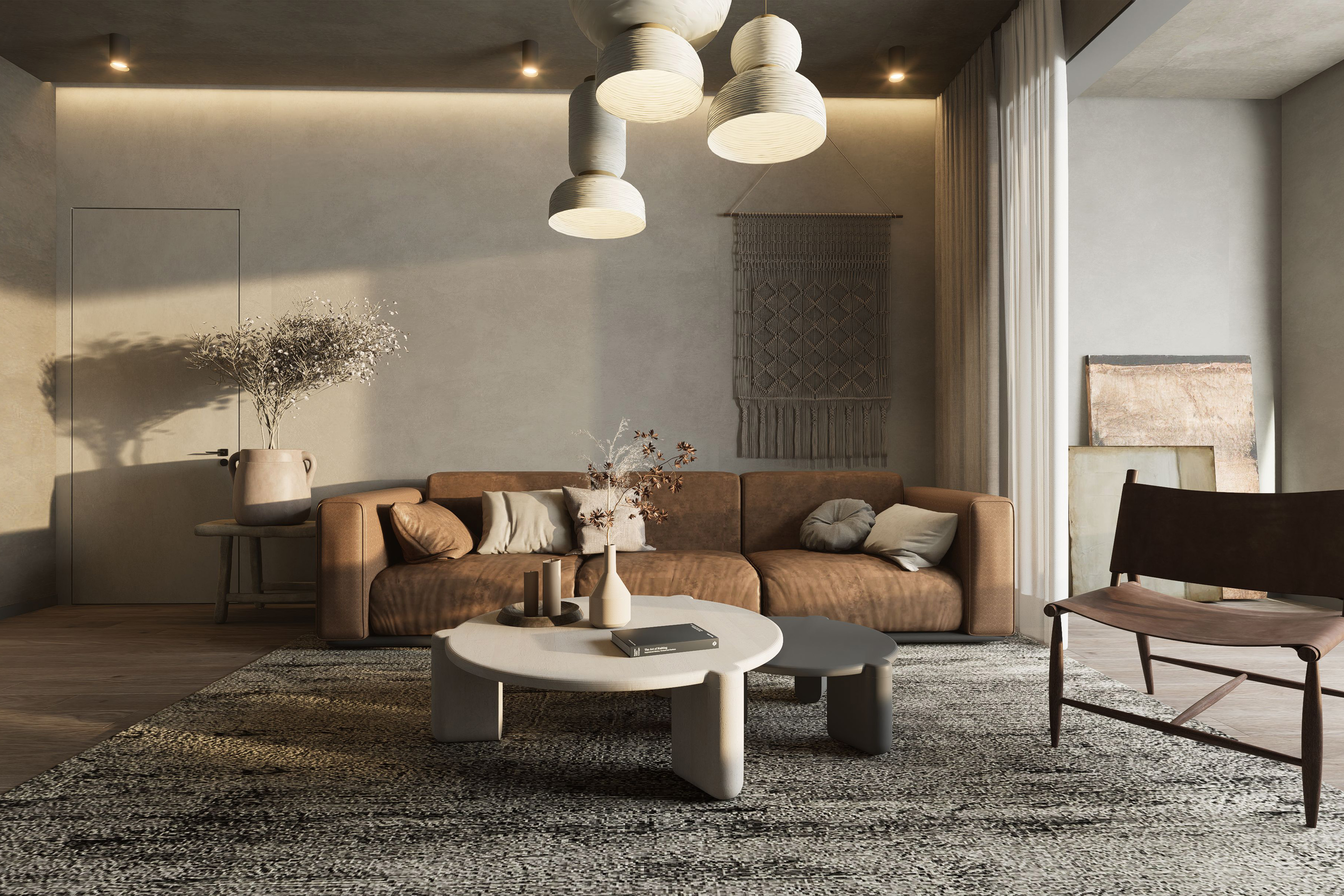
The underlying aesthetic of Wabi-Sabi is embracing time and imperfection: the mottled texture of micro-cement, the cracking feel of raw wood, and hand-painted textures. Its sense of luxury comes from "restrained naturalness," rather than deliberate aging that looks dirty.
• Color: Earthy color palettes—taupe, camel, flax, and smoked wood tones—are greyer and lower in brightness than Creamy Style, with pure white almost entirely absent.
• Materials: Natural wood veneers (especially those featuring cathedral grain and knotty textures), micro-cement textured door panels, and hand-finished lacquer textures are the main battlegrounds for this style. The authenticity of materials is its lifeline: sticker-simulated "Wabi-Sabi" gives away its artificiality at close range.
• Form: Lines should feel relaxed and substantial. Narrow-edge trims are outperformed by wide-edge flush trims, and sharp right angles are less ideal than slight chamfers. Forms should lean toward rustic simplicity rather than cleverness; redundant styling ruins the atmosphere.
• Hardware & Details: Hardware should "disappear"—concealed hinges, handleless designs, embedded pulls; select oxidized bronze or matte black titanium for metal components, avoiding any glossy finishes.
• Lighting: Warmer and dimmer (2700–3000K), focusing on wall-washing and ambience, with interior cabinet lighting kept minimal. Light in a Wabi-Sabi space outlines material contours rather than illuminating everything.
One-Sentence Pitfall Warning: Wabi-Sabi suffers the highest failure rate because the fault tolerance of "plainness" is lowest—insufficient panel eco-ratings, blackened edge banding glue lines, or mismatched wood grains have nowhere to hide in a minimalist space. The quieter a style, the higher the craftsmanship required to back it up.
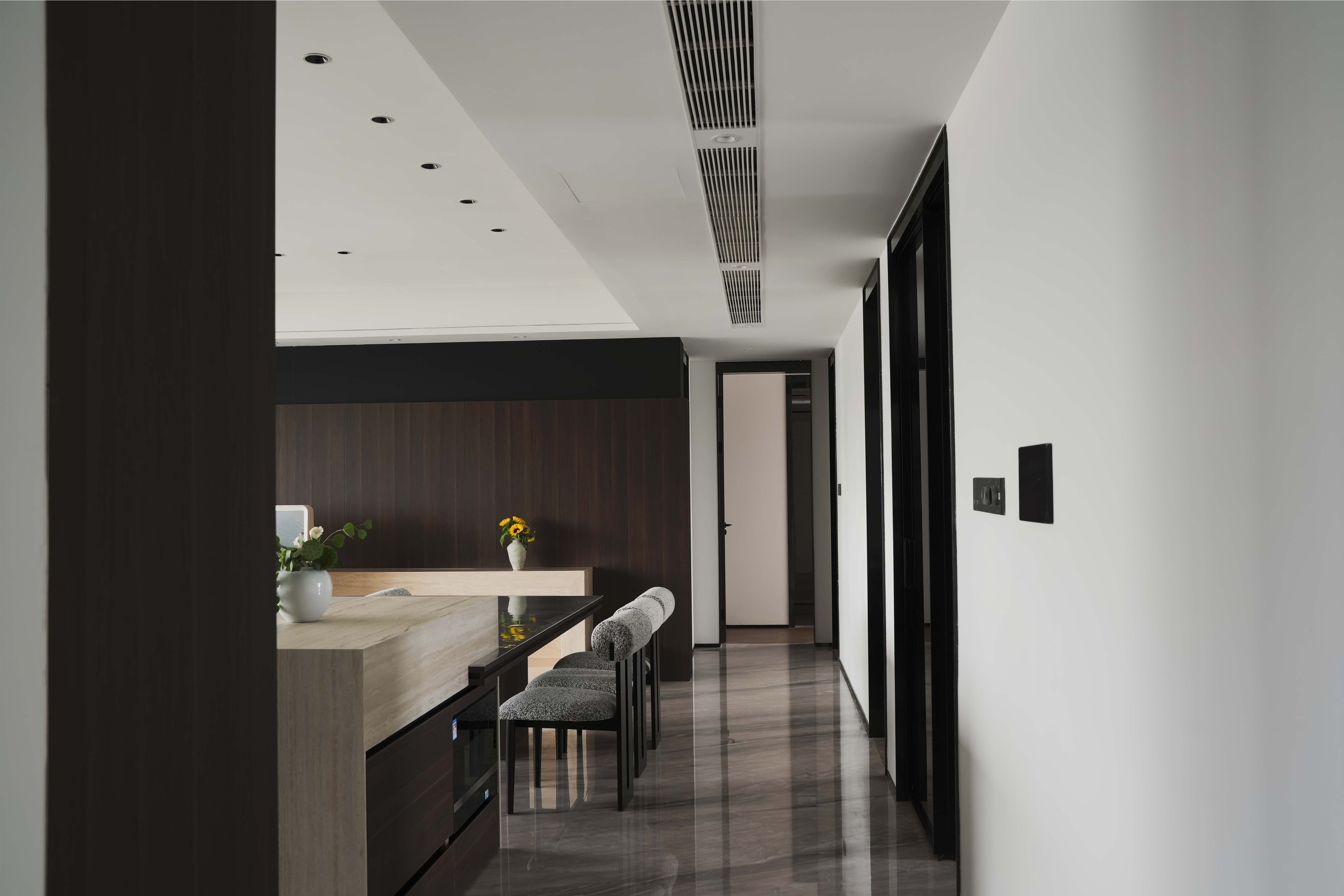
Italian Minimalism is completely different from the softness of Creamy Style and the rusticity of Wabi-Sabi—it is precise, crisp, and powerfully restrained. Milanese luxury stems from millimeter-level alignment and material collision.
• Color: Neutral dark base tones—smoked oak, dark grey, obsidian black, contrasted with warm white, creating a "dialogue between dark and light." Italian Minimalism never pursues an all-house single color, but rather restrained contrast.
• Materials: Combinations of natural wood veneer, metal, glass, and leather serve as its signature language. Steel shelf boards within open racks, aluminum-framed glass doors, and leather-faced drawers all fit comfortably within this style—the key is that every material must be genuine and refined; too many replicas reduce it to an "office aesthetic."
• Form: Floor-to-ceiling doors, narrow-edge trims, floating cabinetry, and flush wall-to-cabinet alignment are all strict benchmarks. In Italian Minimalism, a 1-millimeter gap discrepancy is visible to the naked eye.
• Hardware & Details: This is the heavyweight champion of Italian Minimalism: pin hinges, pivot hinges, concealed sliding door systems, and motorized bus doors. The more invisible the hardware, the higher the demand on structure and precision. It truly tests the factory, not the designer's pen.
• Lighting: Linear lighting and front/rear shelf washing use light to emphasize volumetric relationships, maintaining a neutral color temperature (primarily 3500–4000K, with adjustable local zones).
One-Sentence Pitfall Warning: Italian Minimalism does not compete on expensive materials, but on minimal tolerances. Floor-to-ceiling flat doors, handleless fronts—these designs featuring "nothing at all" are precisely the designs where nothing can go wrong.
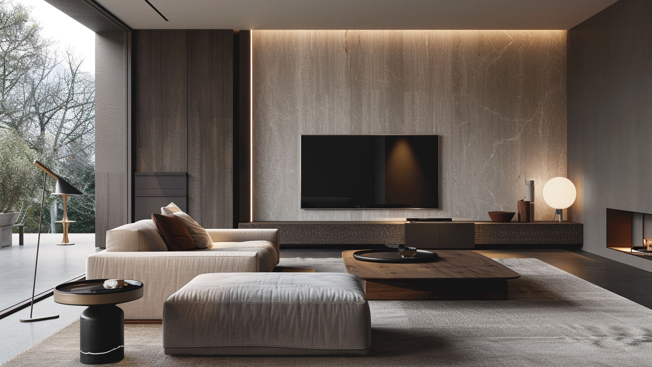
Condensed into single phrases: Creamy Style is "soft," winning on approachability while risking cloyingness; Wabi-Sabi is "rustic," winning on authenticity while possessing extremely low fault tolerance; Italian Minimalism is "precise," winning on accuracy while collapsing the moment any detail slackens.
Creamy Style relies on color management and color-matched joinery; messy materials and sheens ruin the effect instantly.
Wabi-Sabi relies on material authenticity and environmental pedigree; pristine spaces tolerate no glue lines or flaws.
Italian Minimalism relies on tolerances and hardware systems; a 1-millimeter door gap or an exposed hinge collapses the entire spatial aura.

Creamy Style fears being "cluttered, glossy, and cloying"—mixed materials and chaotic sheens look cheap.
Wabi-Sabi fears looking "fake, dirty, and exposed"—lowest fault tolerance, where eco-ratings, glue lines, or mismatched wood grains betray the design.
Italian Minimalism fears "misaligned gaps and exposed hardware"—demanding the strictest tolerances and hardware systems.
The mellowness of Creamy Style, the rusticity of Wabi-Sabi, and the precision of Italian Minimalism are essentially different expressions of the same goal—delivering an emotion completely into a space through materials, forms, and details. Style is never as simple as picking a reference image; it represents the sum of color management, surface treatment, form craftsmanship, and hardware systems, ultimately testing a custom factory's capability to translate emotion into precision.
Baodao Home utilizes a multi-craft system spanning self-produced lacquers, wood veneers, and PET, alongside integrated color-matched designs, to support the flawless execution of all diverse Styles: curved joinery, hole-free connections, millimeter-level edge banding, and factory pre-assembly verification, ensuring styles extend far beyond mere renderings.

Block Quote